

Updated on: 2026-07-16
Artistic Botanical Designs connect visual art with living nature. They use botanical forms, textures, and color harmony to create meaningful patterns for clothing and accessories. When applied with thoughtful layout and careful color control, botanical artwork can feel refined, wearable, and timeless. This guide explains how to plan design direction, select complementary palettes, and maintain quality from concept to final presentation.
What are Artistic Botanical Designs?
Key elements that make botanical artwork look elegant
Step-by-step guide to creating Artistic Botanical Designs
What to avoid when working with botanical patterns
What are Artistic Botanical Designs?
Artistic Botanical Designs are pattern and artwork systems inspired by plants, flowers, leaves, and natural growth. They go beyond a simple illustration style. They translate organic shapes into repeatable, wearable compositions that hold structure, balance, and visual rhythm. In fashion, the goal is not only beauty. It is clarity, comfort, and a design that remains attractive through movement and everyday use.
Botanical artwork typically relies on recognizable forms such as petals, stems, vines, and layered foliage. However, artistic versions interpret those forms with intention. Lines may be softened, edges may be simplified, and details may be stylized so the design reads well at different distances. This is essential for modestwear, where fabric coverage and paneling demand a composition that looks harmonious across the whole garment.
Key elements that make botanical artwork look elegant
High-impact botanical design is built from several controllable elements. When these parts work together, the result feels cohesive rather than decorative noise.
- Botanical structure: stems, branching paths, and leaf groupings that create a clear “flow” across the surface.
- Layered value: variation in light and shadow that makes forms look dimensional even in a flat print.
- Edge quality: smooth transitions and consistent line weight so motifs look intentional.
- Spacing and breathing room: enough negative space to prevent the design from overwhelming the wearer.
- Color harmony: palette decisions that respect skin tones and match neutrals, warm hues, and cool hues.
- Placement logic: alignment with seams, hems, and garment panels so the design looks balanced.
Step-by-step guide to creating Artistic Botanical Designs
The fastest way to improve artistic botanical output is to treat it like a workflow. Each stage should reduce uncertainty and increase design clarity. Follow this sequence to develop motifs that are both expressive and practical.
1) Gather botanical references and define the direction
Start with observation rather than copying. Collect reference material from botanical books, nature photography, and real plant studies. Then select a narrow direction: for example, “fine leaf texture,” “flower clusters,” or “vine tracing.” A focused direction helps the artwork maintain consistency across repeated elements.
2) Decide motif scale and repetition type
Scale controls visual weight. Small motifs create delicacy. Large motifs add presence. Choose a repetition strategy based on the intended garment surface. For panelled clothing, it often works best to maintain predictable spacing so the artwork looks organized when placed on different sections.
3) Build composition with flow and balance
Sketch in layers: first place a main vine or stem path, then attach leaf groupings, and finally add flowers or secondary textures. Balance comes from counterweight. If one corner is dense, the opposite side should be lighter or include a quieter motif type. This prevents the design from feeling heavy.
4) Create a palette that supports wearability
Choose a palette that can live next to neutrals. For example, olive, soft sage, muted rose, and warm cream tend to work well across many modest wardrobes. Limit the number of dominant colors. Then introduce accent tones sparingly. A controlled palette supports long-term versatility.
5) Refine line quality and manage detail density
Botanical designs often fail when detail becomes inconsistent. Decide where the eye should land. Keep primary motifs crisp and allow secondary elements to be slightly softer. Consistent line weight improves credibility and makes the design appear intentional rather than accidental.

Leaf silhouettes, flowing vine curves, and calm negative space
6) Prepare the artwork for fabric behavior
Fabric changes how design reads. Lightweight materials may highlight fine lines. Heavier weaves can reduce micro-detail visibility. Test the artwork concept against the expected texture and drape. For chiffon, translucency can make layered colors appear richer. For opaque cotton blends, the same palette may need slight value contrast to remain legible.
7) Pair the design with compatible garment elements
In modest fashion, neckline shapes, sleeve coverage, and garment structure affect how botanical patterns are perceived. Align motif placement with seams to avoid awkward breaks. If your design includes dense clusters, place them where they can “frame” the body rather than interrupting long visual lines.
8) Review for visual consistency across contexts
Quality is not only about beauty. It is about repeatability. Review the design at multiple sizes and on different mockups. Check edge behavior, ensure colors remain stable, and confirm that key motifs remain recognizable when viewed from a distance.
Example of a botanical-forward direction:
Botanical Heritage – Digital Chiffon Collection

Botanical Heritage – Digital Chiffon Collection
Tips
- Use a clear focal point: choose one primary flower cluster or a dominant vine path to anchor the composition.
- Maintain value contrast: make sure light and dark areas remain distinct after printing.
- Repeat with restraint: repetition improves cohesion, but over-repetition can remove visual calm.
- Choose skin-friendly accents: soft rose, warm beige, and gentle greens often complement modest wardrobe foundations.
- Test motif readability: view the artwork from a step away to confirm it reads as botanical, not clutter.
- Coordinate with solid garments: botanical designs perform best when paired with solid colors that support the palette.
If you want botanical designs that feel graceful and light on the body, consider pairing them with complementary headwear options such as Garden Heritage chiffon for palette continuity.
What to avoid when working with botanical patterns
Even strong botanical concepts can lose credibility when execution becomes uncontrolled. Avoid these common issues:
- Overcrowding: too many small elements compete for attention and reduce legibility.
- Inconsistent color temperatures: combining overly warm and overly cool greens without harmonizing midtones often looks unstable.
- Broken motif logic: vines or leaves that appear to float can look disconnected from natural growth.
- Hard transitions: abrupt shifts in line thickness can make the design feel rough.
- Ignoring garment placement: seams and panel boundaries can cut the design in ways that disrupt focal balance.
How to style botanical prints for modest wardrobes
Styling is where botanical artwork becomes a personal statement. The design should work with modest silhouettes rather than against them. Begin with color coordination, then add texture and form.
Color framework for botanical outfits
Use a simple approach: choose one dominant botanical color, then support it with neutrals. For instance, if the artwork includes soft olive and warm cream, pair it with beige, camel, or muted charcoal. This keeps the look refined and prevents the print from competing with every other element.
Headwear alignment and print continuity
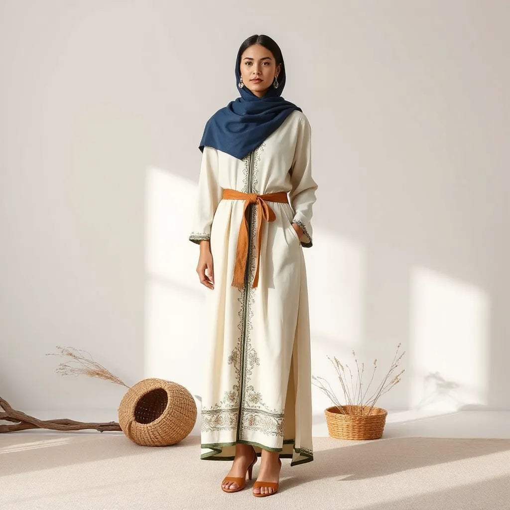
Headwear can make or break the final harmony. When the headscarf color family matches the botanical palette, the look feels intentional. If the botanical design includes cool greens, select headwear that echoes those tones without introducing a conflicting theme.
For example, you may pair botanical-inspired fabrics with a complementary underlayer such as cotton inner hijab to preserve comfort and support clean drape lines.
Layering by texture, not by clutter
Botanical prints often include fine linework and layered value. To keep the silhouette balanced, rely on texture layers rather than additional prints. Choose solids for outer layers and let the botanical motif remain the focal point.

Palette swatches, drape lines, and balanced floral placement
Maintain consistency across everyday wear
Artistic Botanical Designs should remain attractive over time. Select pairings that do not depend on seasonal trends. Botanical greens and soft florals tend to stay relevant because they draw from enduring natural forms.
For those seeking a coordinated modest set, botanical prints can be supported by well-structured accessories. If you style with a bonnet, consider Syrian-style closed bonnet to maintain shape while preserving a clean design line.
FAQs
What makes Artistic Botanical Designs different from basic floral prints?
Artistic botanical work emphasizes botanical structure, composition flow, and disciplined color harmony. Instead of repeating a single flower image, it uses stems, leaf groupings, and value variation to build a system that stays balanced across the garment surface.
How do I choose a color palette for botanical motifs?
Start with a dominant botanical color, then select one neutral support tone and one accent shade. Keep midtones consistent and avoid mixing extreme warm and cool greens without bridging hues. Test the palette on a range of background colors to confirm readability.
Can botanical designs work on modest silhouettes without looking busy?
Yes. The key is placement and spacing. Concentrate density around natural focal zones and give the design breathing room across open panels. Pair the print with solids so the botanical pattern remains the primary visual story.
How can I ensure the design still looks good after printing?
Review the design at multiple scales and check that fine lines remain visible. Maintain sufficient contrast between background and motif elements. If possible, preview the artwork on fabric with a similar texture and drape to catch clarity issues before production.
Wrap-up & Final Thoughts
Artistic Botanical Designs are an effective way to express nature-inspired elegance with disciplined visual planning. By selecting a clear botanical direction, building a balanced composition, and using a wearability-focused palette, the design becomes more than decoration. It becomes a coherent artwork that integrates smoothly into modest styling.
If you are preparing new prints or curating outfits, prioritize readability, controlled color harmony, and thoughtful placement. When those elements align, botanical patterns feel timeless and confidently wearable.
About the Author
Sulieman Alhazma is an expert in artisan-driven design direction, with a focus on heritage-inspired patterns and modern modestwear presentation. With a practical understanding of how artwork translates onto garments, he helps brands create cohesive visual stories that respect quality and cultural craftsmanship. His work emphasizes clarity, balance, and long-term style value. He welcomes thoughtful feedback and aims to make design guidance feel approachable for creators and shoppers alike.
Disclaimer: This article is for educational purposes only and does not constitute professional design, printing, or purchasing advice. Results may vary based on materials, printing methods, lighting conditions, and individual styling preferences.
The content in this blog post is intended for general information purposes only. It should not be considered as professional, medical, or legal advice. For specific guidance related to your situation, please consult a qualified professional. The store does not assume responsibility for any decisions made based on this information.